Settings
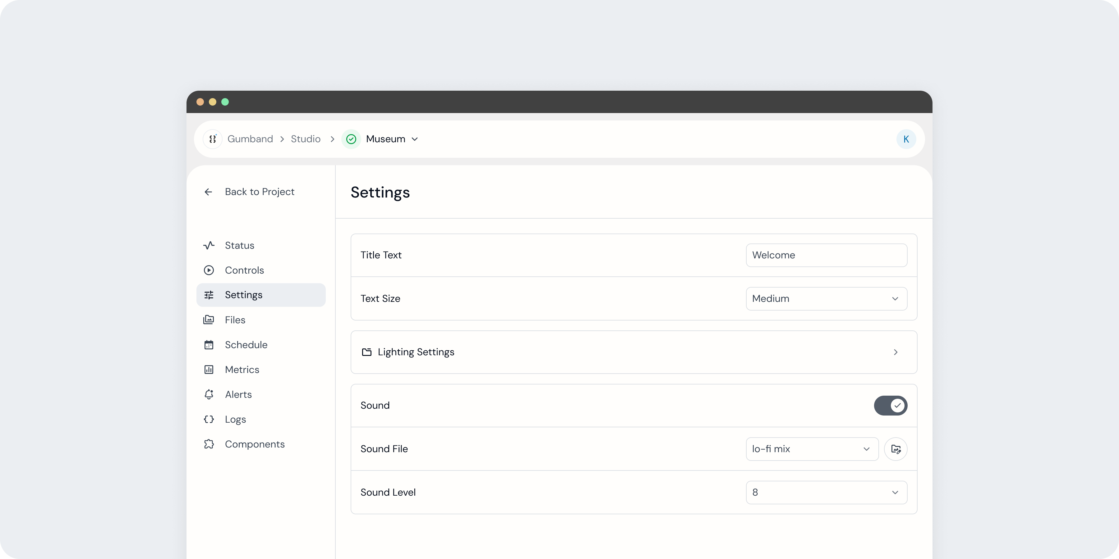 An exhibit’s Settings page in the Gumband UI.
The Settings page allows you to manage your exhibit’s configurations directly from the Gumband UI. These settings are defined by a developer during your exhibit’s setup and enable you to adjust key parameters that shape the exhibit experience, such as volume level, text copy, content selection, or any other parameter needed to operate and manage your exhibit experience.
Settings can come with a variety of input types, including text fields, dropdowns, and toggle switches, allowing them to support a wide range of use cases for managing your exhibit.
Learn more about setting types and how to configure them in the Exhibit Manifest Configuration docs here.
Update Exhibit Settings
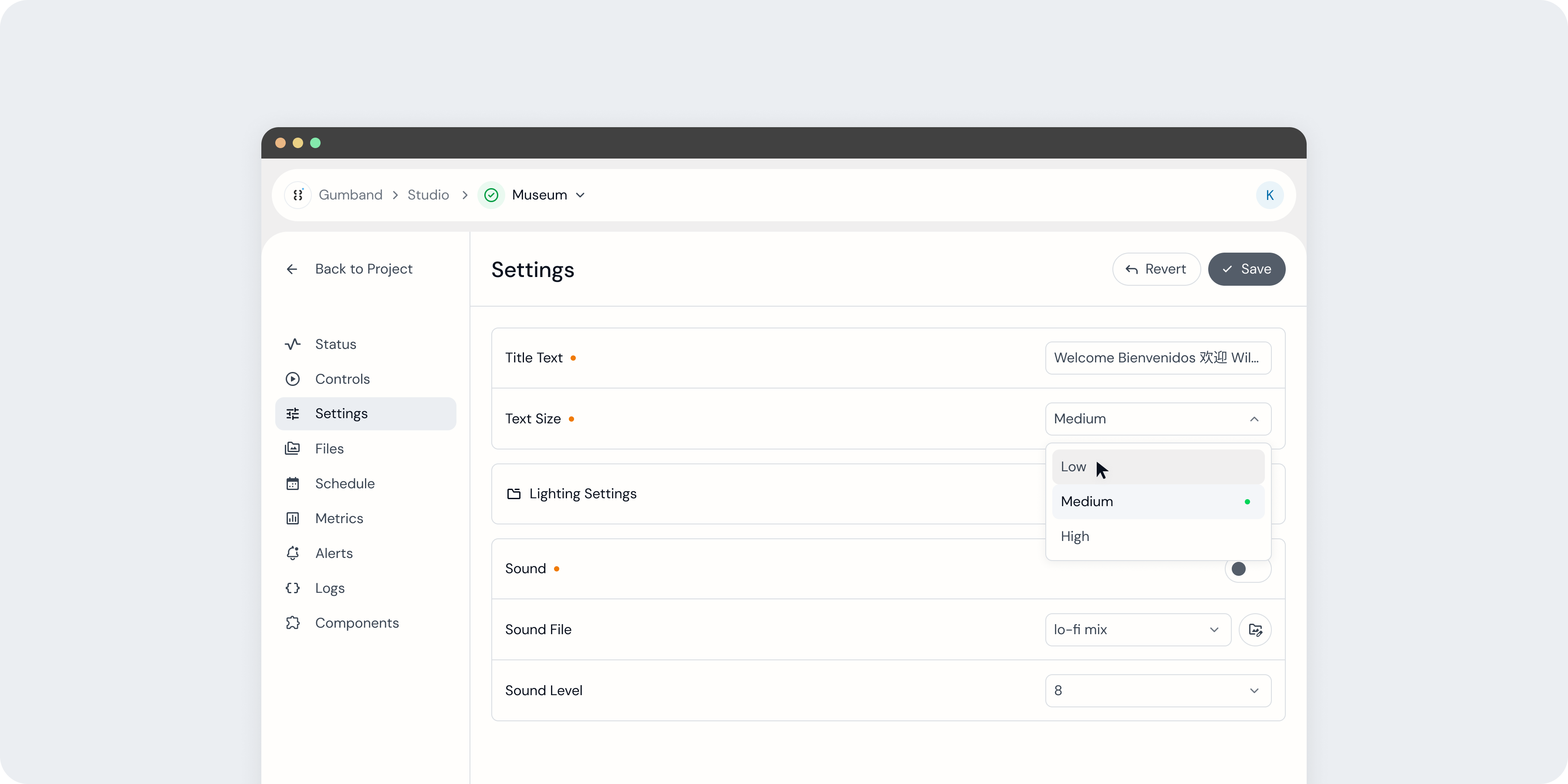 Settings with unsaved changes are indicated with an orange dot next to that setting’s name.
Settings may be changed in Gumband’s UI, but those changes will not be pushed to your exhibit until you use the Save button.

This button appears in the page’s top-right corner when any settings have been updated and, when pressed, saves all changes to your exhibit. Pressing “Revert” will discard all changes.
Updates to exhibit settings may be scheduled ahead of time using your exhibit’s Schedule page. Learn more about Scheduling settings changes here.
If an exhibit's components are disconnected from Gumband, your setting updates may not get synchronized until your exhibit is back online.
Operating Mode
Operating Mode is a deprecated feature.
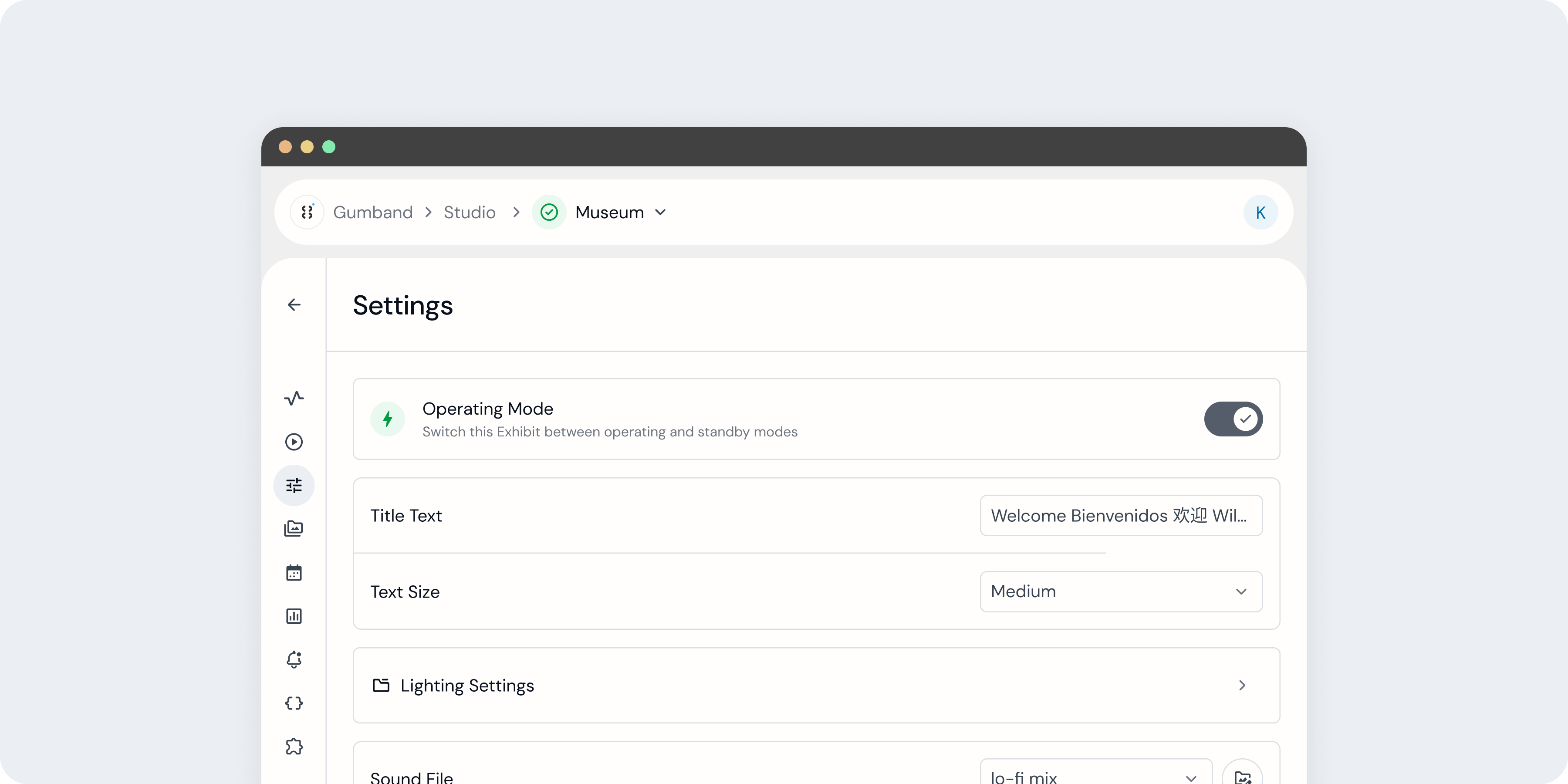 An exhibit in operating mode.
Depending on your exhibit’s configuration, you may see a setting labeled "Operating Mode" on your Settings page. This allows you to switch between “operating” and “standby” modes, each encompassing a number of operation parameters, defined by your exhibit’s developer.
 An exhibit in standby mode.
Settings Groups
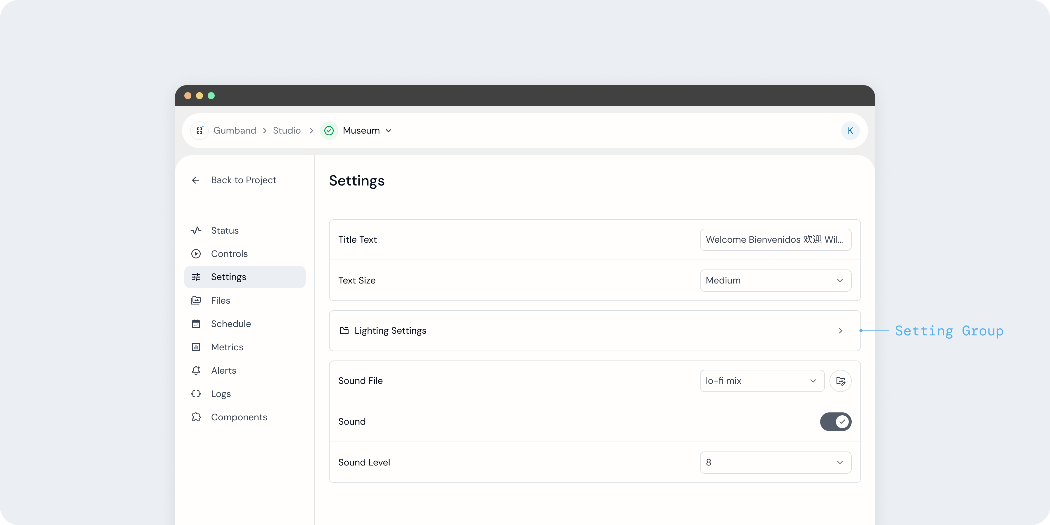 A Settings page with one Settings Group.
Settings Groups help organize settings like a folder—and in fact appear on the Settings page as a card with a folder icon.
 Navigating through Settings Groups.
After selecting a Settings Group, you will see all settings contained within that Group, as well as a breadcrumb navigation that will help you move throughout your exhibit’s Settings organization.
Settings Lists
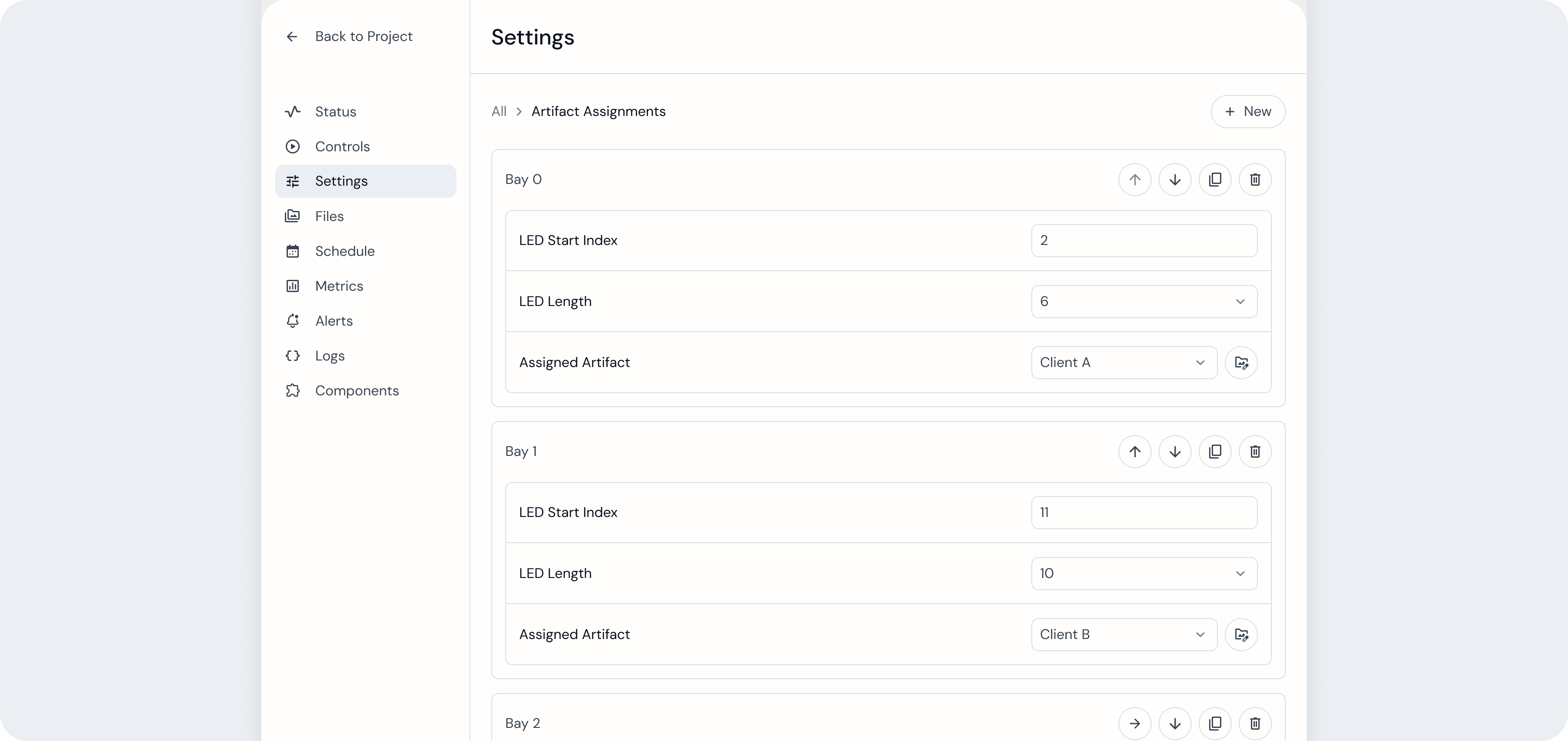 A Settings List in the Gumband UI. Each Settings List item contains the same format of three setting inputs, but each has been assigned different values.
While Settings Groups may contain a predetermined set of settings defined in your exhibit’s code, Settings Lists allow you to create a template for a group of settings where you can add, delete, and reorder instances of that template–all from the Settings page and without modifying any of your exhibit’s code.
Settings Lists can be very helpful in updating an exhibit experience that involves elements with a variable number of instances with the same format.
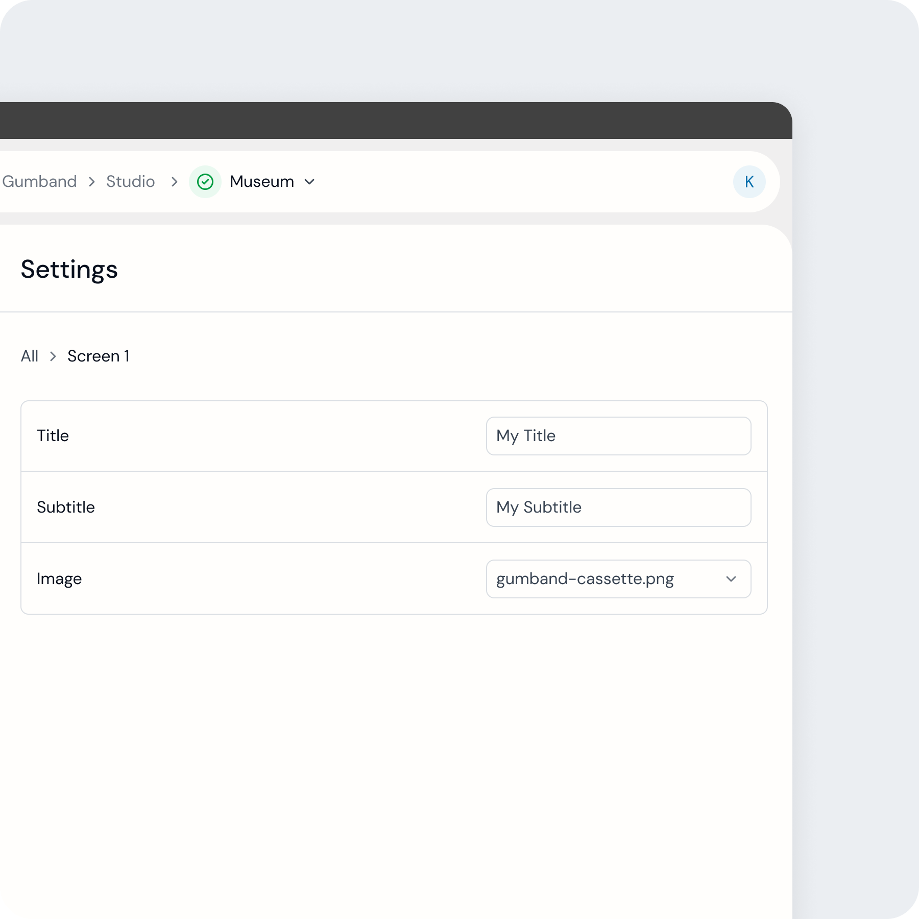 Settings for one screen withing a single Settings Group.
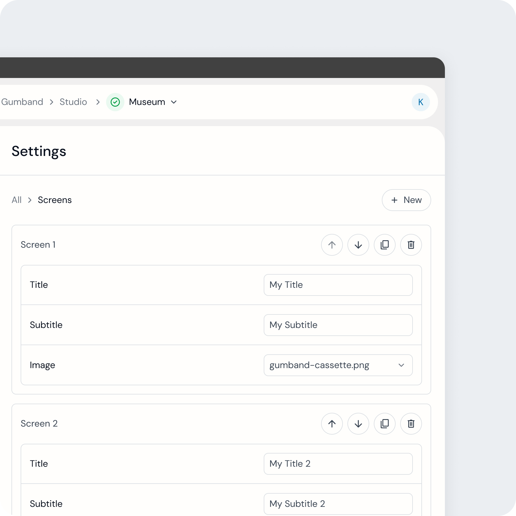 Settings for two screens using the same format within a Settings List.
For example, an exhibit may present viewers a variable number of on-screen steps, each of which requires three settings in Gumband for managing their content (for example, title text, subtitle text, and a hero image). If you don't ever expect the number of steps presented to viewers to change, you could create a Settings Group to represent each one and their settings.
However, if you expect the number of steps could change over time, you could create a Settings List with the template needed and add, remove, or reorder steps directly from the Gumband UI as needed.
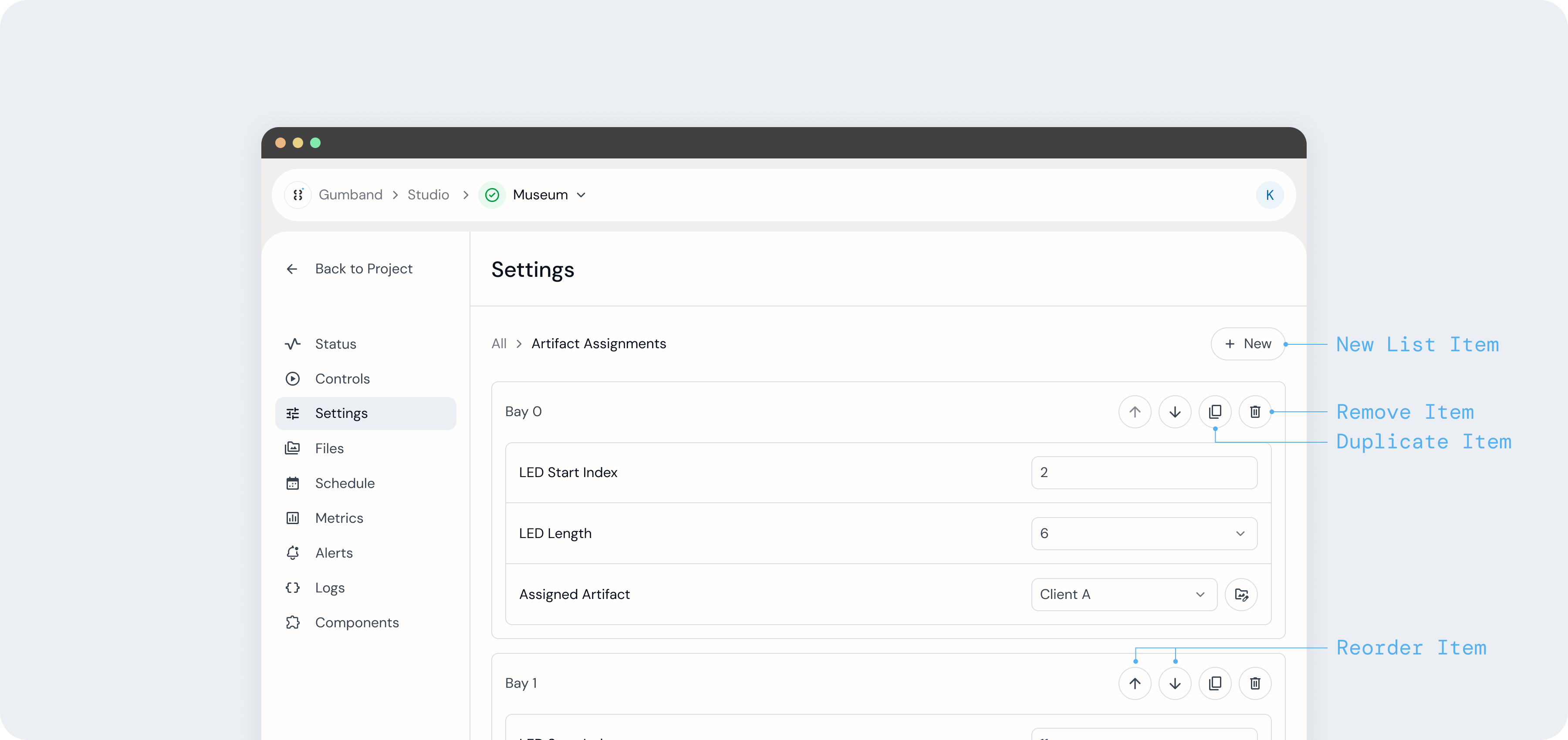
To create a new Settings List item directly from the UI, press the New button at the top of your Settings List. Each item in the Settings List includes controls to rename, reorder, duplicate, and remove that settings list item.
Learn more about how to implement Settings Lists into your exhibit in the developer docs.