Analytics
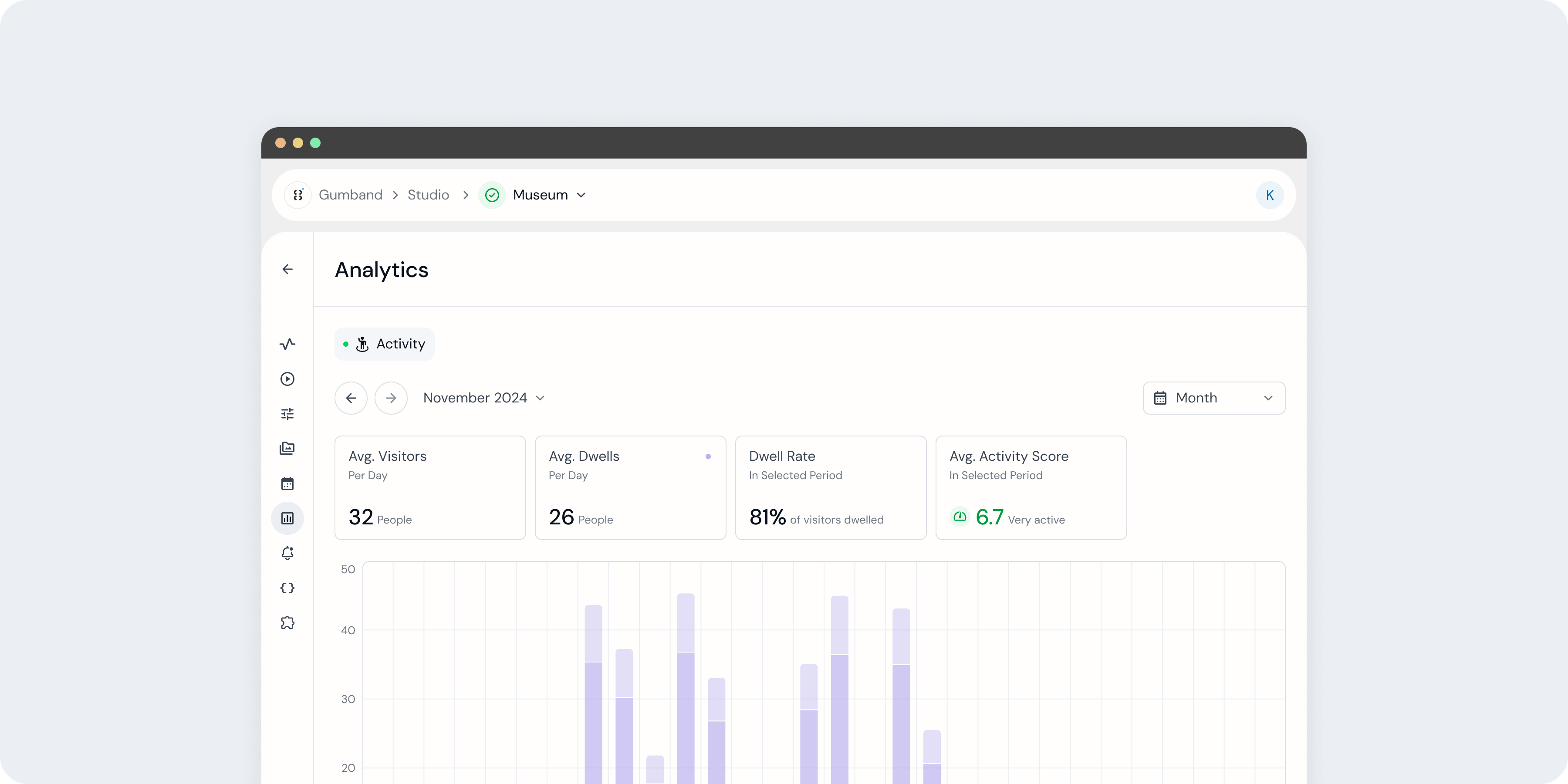 An exhibit's Analytics page in the Gumband UI.
The Analytics page allows you to dive into how people interact with it, through data visualization and summaries. If a developer has set up your exhibit with Gumband’s measurement capabilities, your Analytics page will include one or more time series charts where you can view real-time and historical measurement of your exhibit.
These charts generally provide insights into data collected on direct interaction or passive engagement with your exhibit. Using both, you can gain valuable insights into user behavior and unlock new ways to refine and optimize exhibit experiences.
Interaction Charts
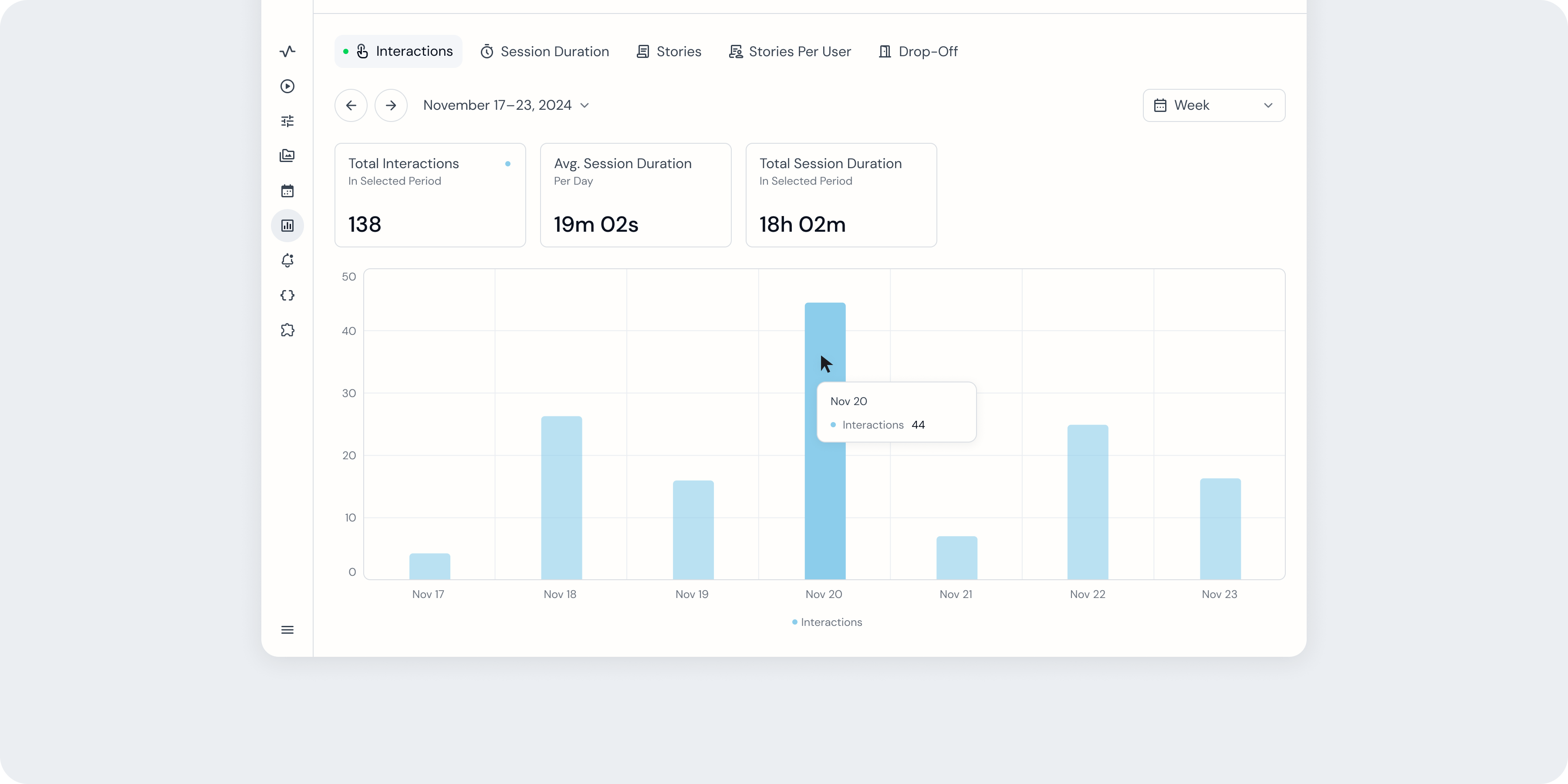 An exhibit's Interaction chart in the Analytics page.
Direct interaction data measure active elements of user interaction with an exhibit, such as button presses or content selections, defined by a developer when integrating your exhibit with a Gumband SDK.
Gumband’s platform provides customizable charts that your exhibit developer can set up, based on what your team needs to understand about exhibit performance. For instance, in an exhibit where users scroll through multiple content pieces to complete the experience, the developer can implement custom code to track the number of users who completed the full experience or how much time each user spent with the experience.
There are several interaction chart formats you may find on your exhibit’s Analytics page.
| Chart | Type | What This Chart Displays | Data Summaries |
|---|---|---|---|
| Interactions | Bar | Total number of direct user interactions with your exhibit. Interaction start and end points are defined via the Gumband SDK. |
|
| Session Duration | Stacked Bar | Total time that users spent interacting with your exhibit, as well as the duration of each constituent interaction. Interaction start and end points are defined via the Gumband. |
|
| Category Popularity | Stacked Bar | How many times overall that users interacted with different options or pieces of content offered by your exhibit. Content types are defined via the Gumband SDK. |
|
| Selections Per User | Stacked Bar | How many options or pieces of content offered by your exhibit that each user interacted with during an interaction. Content types and interactions are defined via the Gumband SDK. |
|
| Category Duration | Stacked Bar | How long each exhibit option or piece of content is viewed by a user. Content types are defined via the Gumband SDK. |
|
| Drop-Off | Stacked Bar | How many times users exited your exhibit’s experience before completing it and the content with which they last interacted before exiting. Content types are defined via the Gumband SDK. |
|
Learn more about our SDKs and integrating with Analytics to set up Interactions charts here.
Presence Charts
Passive engagement data measures how users move around an exhibit space, even when they don’t interact directly with the exhibit. This data is gathered by integrating with Gumband’s PII-free presence sensor that can track viewer dwell counts, dwell time, and movement, plus can generate metrics to quantify spatial popularity.
More information about the Gumband presence sensor coming soon!
Activity Chart
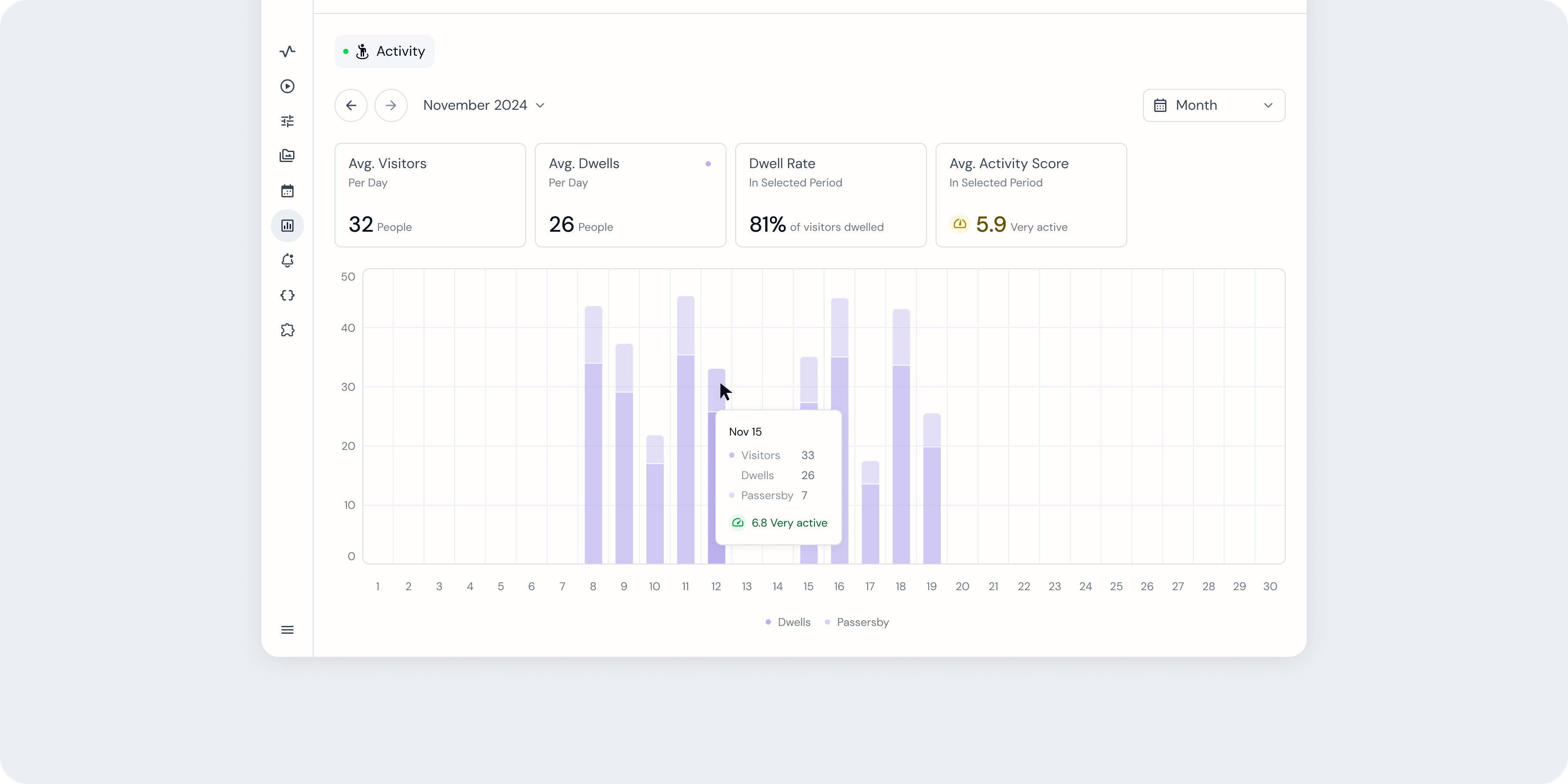 An exhibit's Activity chart in the Analytics page.
Exhibits equipped with a Gumband presence sensor will automatically generate an Activity chart in that exhibit’s Analytics page. The Activity chart provides a view into the passive engagement measured by your presence sensor by plotting how many people occupied that sensor’s field of view over time. Data summaries above the chart calculate daily occupancy and an Activity Score across your current view.
Activity Score
The Activity Score is a metric generated by a presence sensor to assess how much time people spent within a sensor’s field of view. Activity Score values range from 0.0 to 10.0, with 0.0 indicating the least possible activity in a space and 10.0 indicating the most possible activity in that space.
In order to ensure Activity Scores are relevant to the general amount of activity each exhibit sees, values are automatically normalized against the rest of your exhibit’s activity data. This means that historical values may change throughout an exhibit’s lifespan.
For example, if an exhibit is active for one week with a maximum of 100 passive engagements in one day, the initial Activity Score for that day will be 10.0. If engagements increase to 200 per day during the following week, Activity Score values for the first week will have been adjusted lower to reflect the lower activity relative to all data collected.
Using Charts
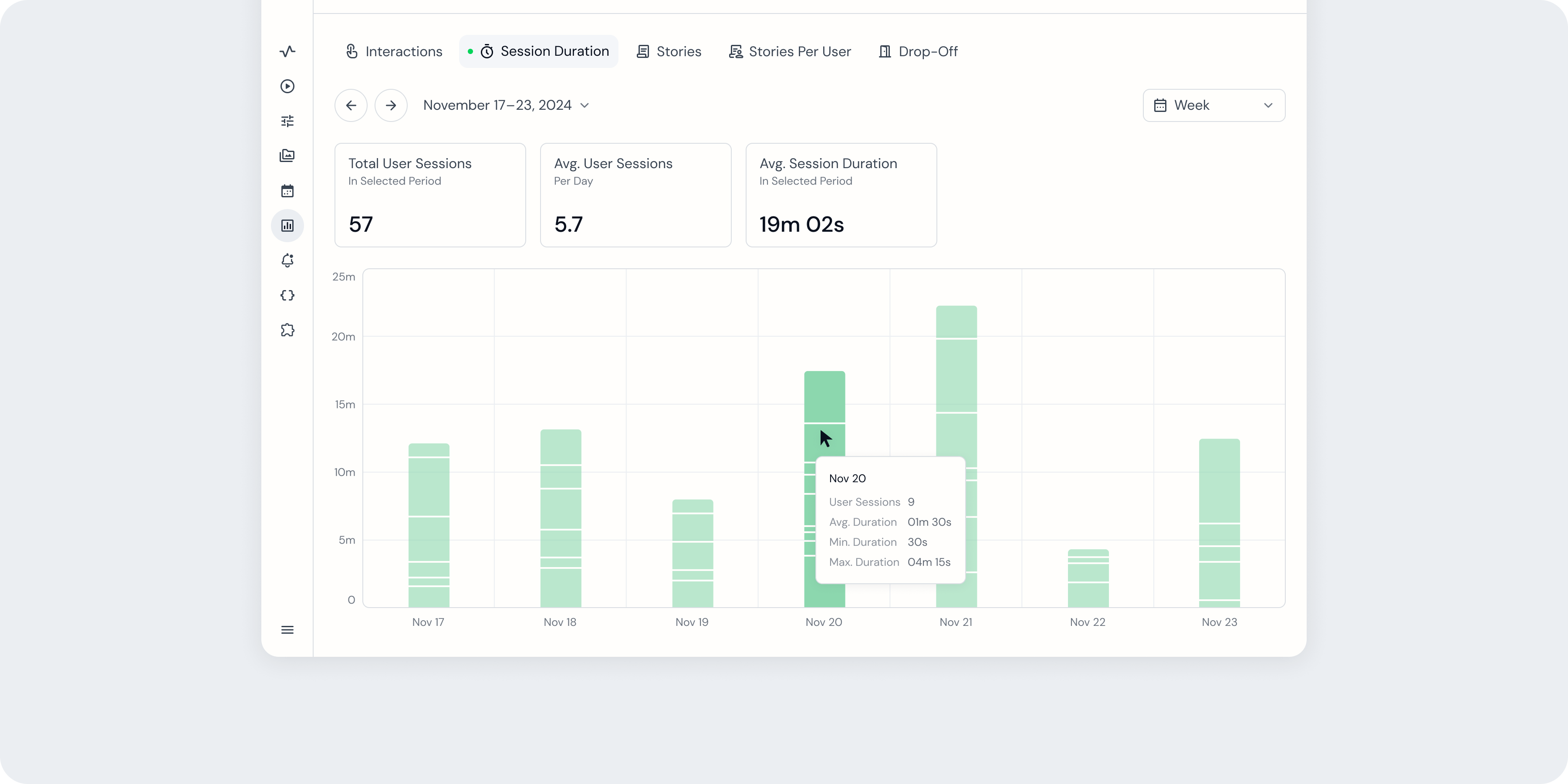 Mousing over chart data in the Analytics page.
When viewing a chart in the Analytics page, you can find more information about your data (such as exact values and, in some cases, supplemental data) in a tooltip that appears when you mouse over bars in your chart.
Switching charts
 An Analytics page with three charts available.
You can navigate between charts available within the Analytics page using tabs above the chart area, indicating each chart’s title.
Customizing Your Chart View
When navigating to a chart, it by default will display a daily summary of data during the current week. The Analytics page offers two ways to adjust this view.
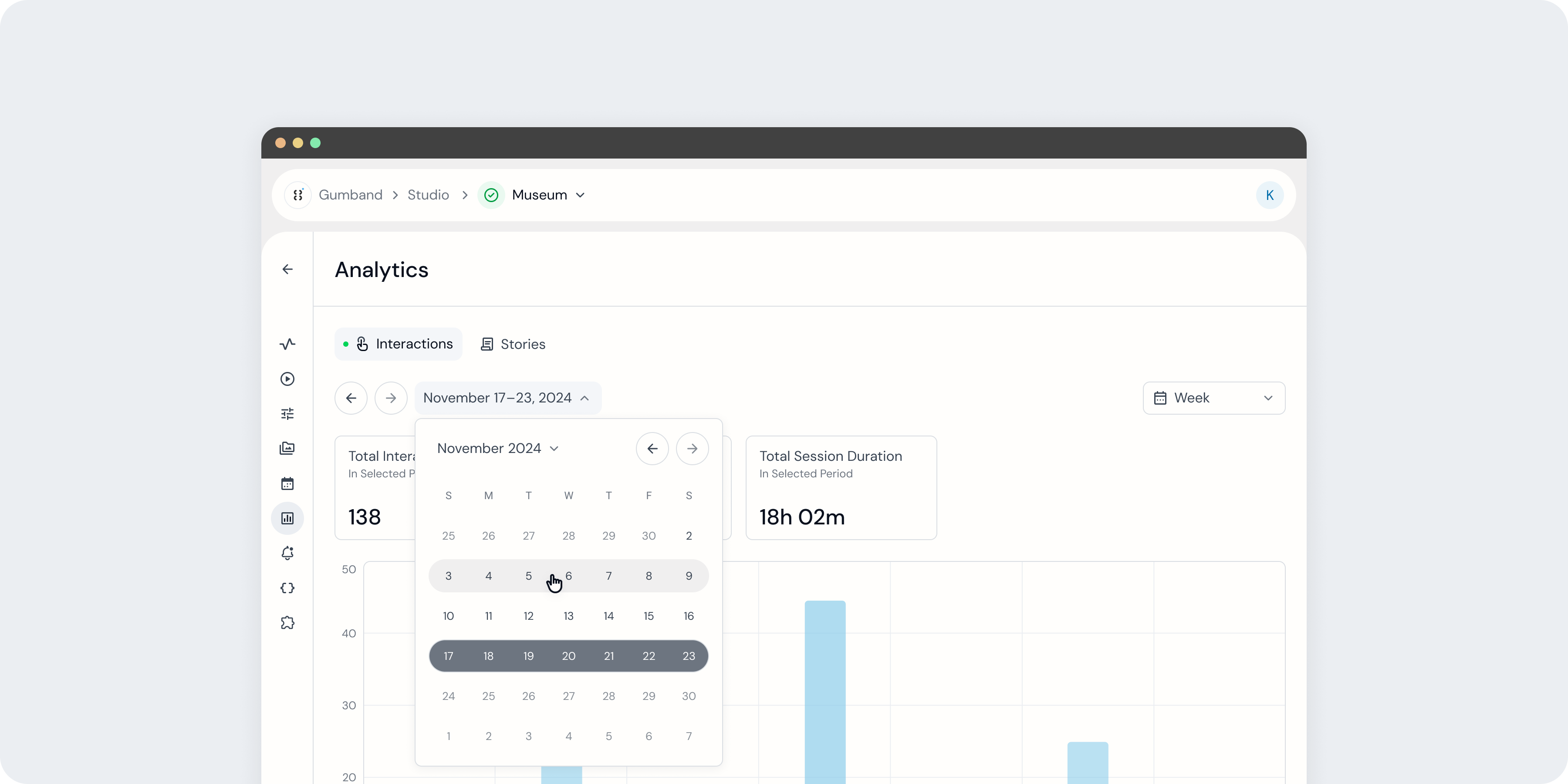 Choosing dates from the date picker.
To view historical data, you can navigate back and forth through time using the date controls below the chart selection tabs. These controls include a back button and forward button, as well as a full date picker accessed by selecting the current date(s) shown above the chart area.
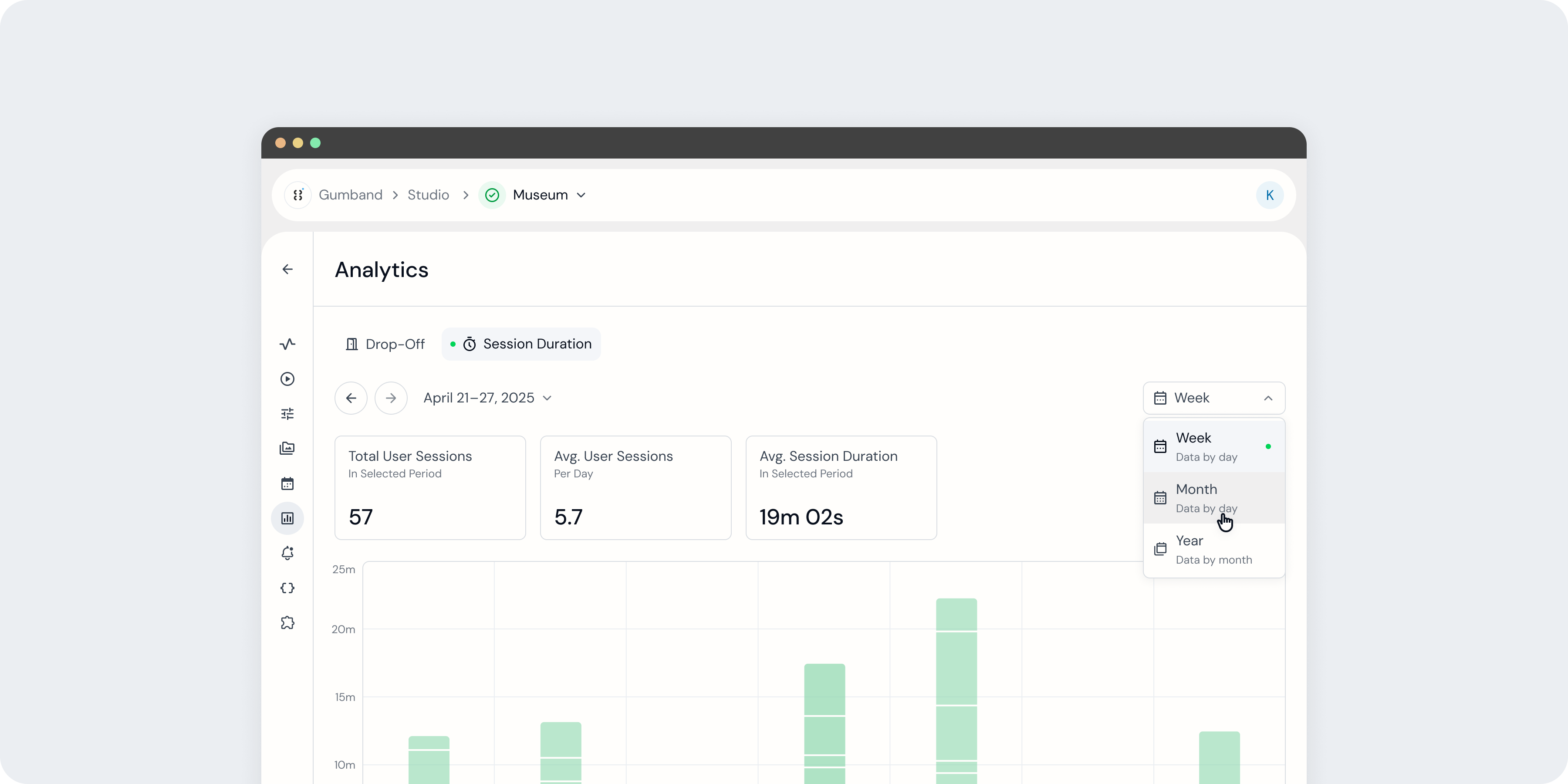 Choosing a date view.
You also can select different date views using the dropdown above the right-hand side of the chart area. These views allow you to see the same data over different calendar periods and using different summary levels. For instance, the Month view of an Interactions chart will display total daily interactions over a month and the Year view of the same chart will display total monthly interactions over a year.
| Duration | Summary Level |
|---|---|
| Week | Daily |
| Month | Daily |
| Year | Monthly |
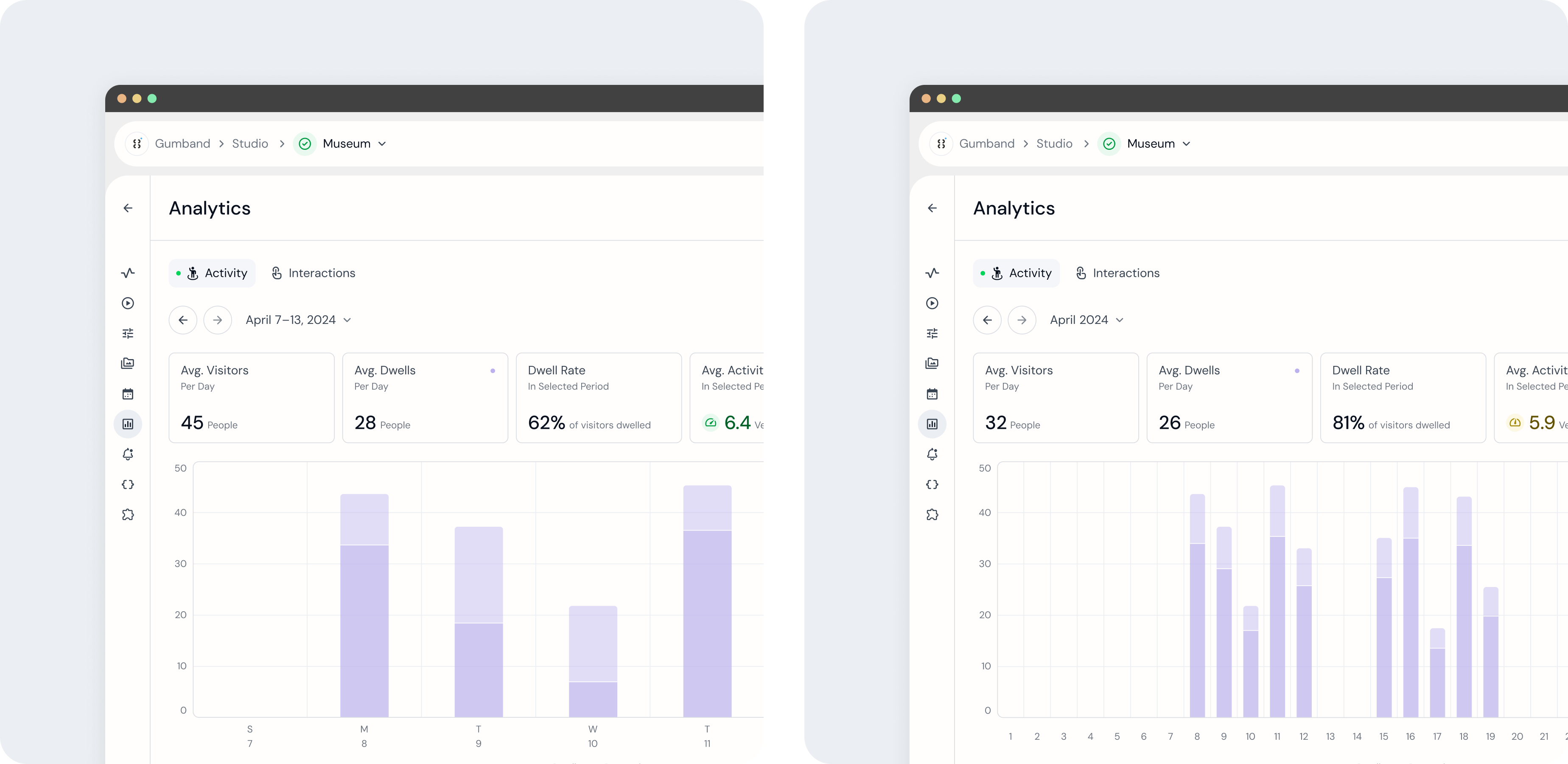 An exhibit's Activity chart in Week and Month views.