Exhibit Manifest Configuration
Exhibit Status Types
String
This status type displays text. If you set the value of a String status to a URL, the Gumband Web UI will automatically parse that url and display the status value as a hyperlink.
export const MANIFEST = {
  manifest: {
    statuses: [
      {
        id: "string_status_1",
        type: "String",
        display: "Example String Status",
        default: "a default value",
        order: 0
      },
      {
        id: "string_status_2",
        type: "String",
        display: "Example String Status with a URL value",
        default: "https://gumband.com/",
        order: 1
      }
    ],
    controls: [],
    settings: []
  }
}
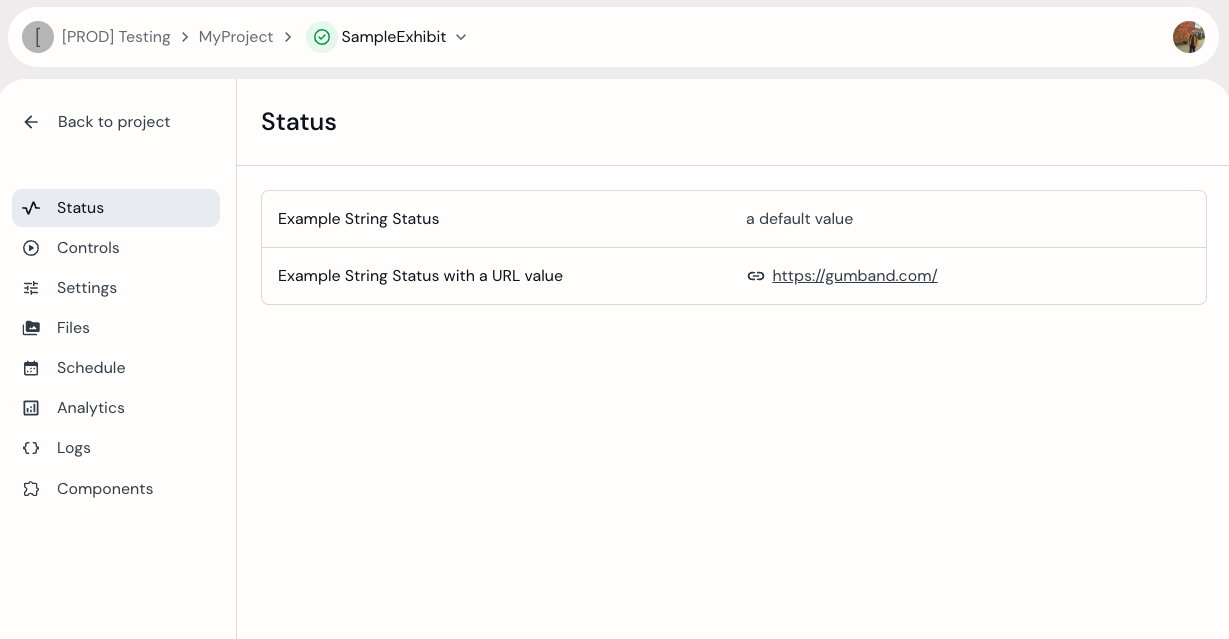 Sample exhibit with Status of type "String"
Group
This type does not define an individual status. Instead, it serves as a parent for a group of statuses that will be displayed together in the Gumband UI.
It includes an additional JSON property:
- items – an array that defines the statuses contained within the group.
This grouping helps organize the Statuses section in the Gumband UI, making it easier to manage and structure exhibit statuses.
export const MANIFEST = {
  manifest: {
      statuses: [
          {
              id: "group_status",
              type: "Group",
              display: "Example Group Status",
              order: 0,
              items: [
                  {
                      id: "nested_string_status_1",
                      type: "String",
                      display: "Example String Status 1",
                      default: "a default value",
                      order: 0
                  },
                  {
                      id: "nested_string_status_2",
                      type: "String",
                      display: "Example String Status 2",
                      default: "a default value",
                      order: 1
                  }
              ]
          }
      ],
      controls: [],
      settings: []
  }
}
Exhibit Control Types
Single
This control type creates a single control button in the UI.
export const MANIFEST = {
  manifest: {
    statuses: [],
    controls: [
      {
        id: "my_control",
        type: "Single",
        display: "Example Single Control",
        order: 0
      }
    ],
    settings: []
  }
}
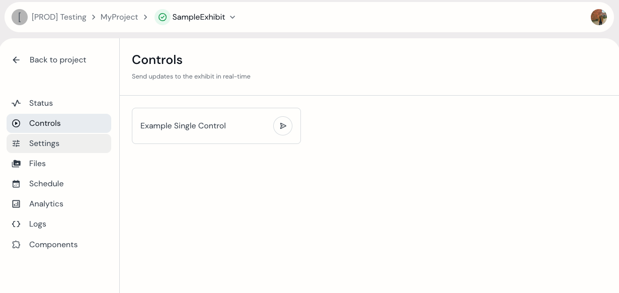 Sample exhibit with Control of type "Single".
Group
This type does not define an individual control. Instead, it serves as a parent for a group of controls that will be displayed together in the Gumband UI.
It includes an additional JSON property:
- items – an array that defines the controls contained within the group
This grouping helps organize the Controls section in the Gumband UI, making it easier to manage and structure exhibit controls.
Gumband does NOT support defining a Group control type in the items of another Group control type.
export const MANIFEST = {
  manifest: {
      statuses: [],
      controls: [
          {
              id: "my_group_control",
              type: "Group",
              display: "Example Group Control",
              order: 0,
              items: [
                  {
                      id: "my_nested_single_control_1",
                      type: "Single",
                      display: "Example Single Control 1",
                      order: 0
                  },
                  {
                      id: "my_nested_single_control_2",
                      type: "Single",
                      display: "Example Single Control 2",
                      order: 1
                  }
              ]
          }
      ],
      settings: []
  }
}
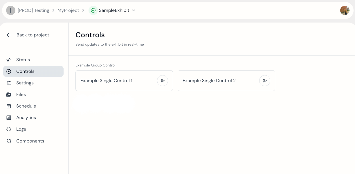 Sample exhibit with 2 "Single" Controls inside a "Group" Control.
Exhibit Setting Types
Toggle
This setting represents a boolean toggle.
export const MANIFEST = {
  manifest: {
      statuses: [],
      controls: [],
      settings: [
          {
              id: "my_toggle_setting",
              type: "Toggle",
              display: "Example Toggle",
              default: false
          }
      ]
  }
}
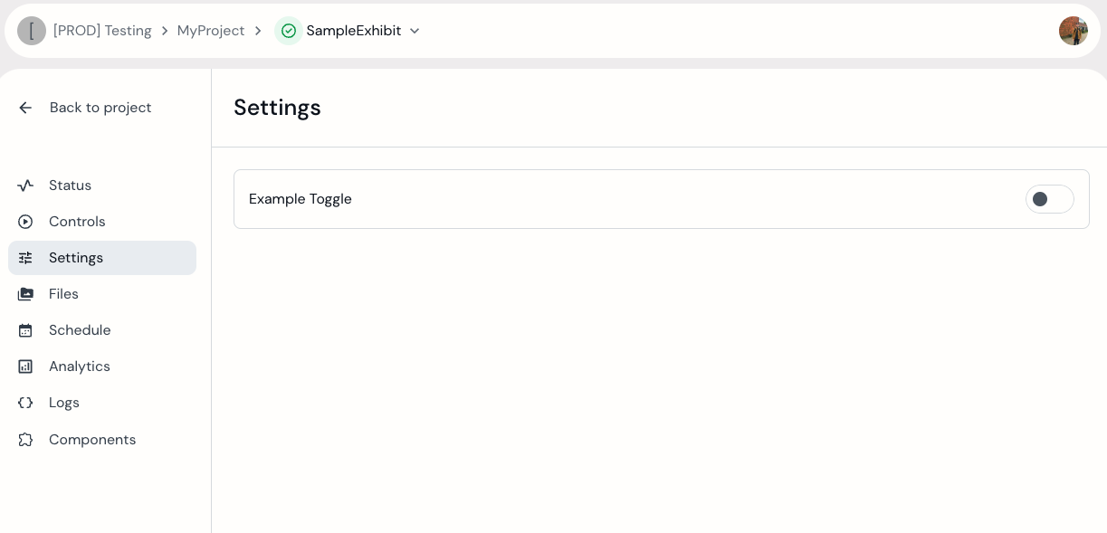 Sample exhibit with "Toggle" type setting.
TextInput
This Setting allows users to enter text.
export const MANIFEST = {
  manifest: {
      statuses: [],
      controls: [],
      settings: [
          {
              type: "TextInput",
              id: "my_text_input_setting",
              display: "Example Text Input",
              default: "Example Setting Value"
          }
      ]
  }
}
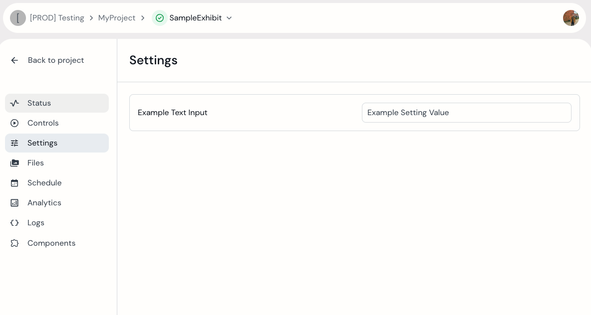 Sample exhibit with "TextInput" setting.
TextAreaInput
This setting type allows users to enter formatted text rather than simply a string like the typical TextInput setting.
export const MANIFEST = {
  manifest: {
      statuses: [],
      controls: [],
      settings: [
          {
              type: "TextAreaInput",
              id: "my_text_area_input_setting",
              display: "Example Text Area Input",
              default: "Example Text Setting Value"
          }
      ]
  }
}
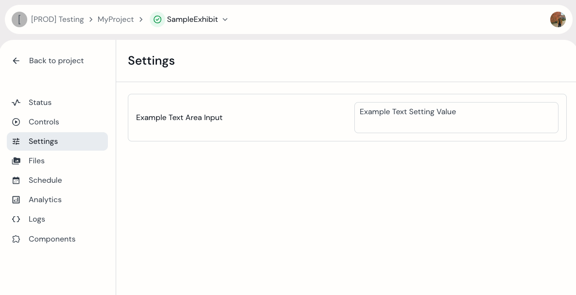 Sample exhibit with "TextAreaInput" setting, allowing for formatted text.
![]()
HexColor
export const MANIFEST = {
  manifest: {
      statuses: [],
      controls: [],
      settings: [
          {
              type: "HexColor",
              id: "my_hex_color_setting",
              display: "Example Hex Color",
              default: "#EEEEEE"
          }
      ]
  }
}
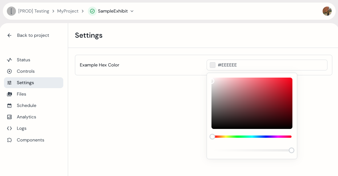 The "HexColor" setting with the color picker modal opened.
Dropdown
This setting type allows user to select one from a set of available drop-down options. Developers define these options with the items JSON property.
export const MANIFEST = {
  manifest: {
      statuses: [],
      controls: [],
      settings: [
          {
              type: "Dropdown",
              id: "dropdown_example",
              display: "Example Dropdown Setting",
              default: "option_1",
              items: [
                  {
                      id: "option_1",
                      order: 1,
                      display: "Option 1"
                  },
                  {
                      id: "option_2",
                      order: 2,
                      display: "Option 2"
                  },
                  {
                      id: "option_3",
                      order: 3,
                      display: "Option 3"
                  }
              ]
          }
      ]
  }
}
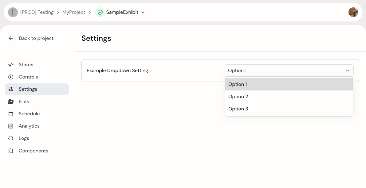 Sample exhibit with "Dropdown" type setting.
FileSelection
This setting type creates a "Dropdown", however the options are populated using the list of files available the exhibit.
export const MANIFEST = {
  manifest: {
      statuses: [],
      controls: [],
      settings: [
          {
              type: "FileSelection",
              id: "file_selection_example",
              display: "Example File Selection Setting"
          }
      ]
  }
}
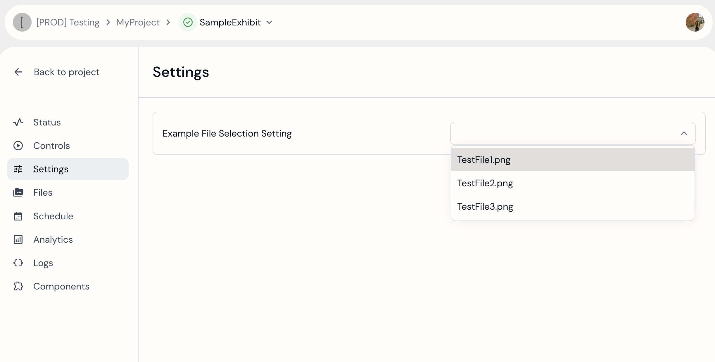 Sample exhibit with "FileSelection" dropdown setting, populated from uploaded files in Files tab.
Exhibit files can be uploaded, downloaded, and deleted via the exhibit “Files” tab.
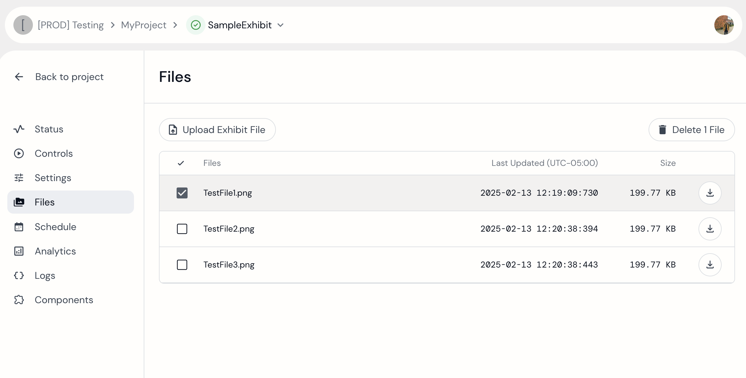 Sample exhibit showing options for files that have been uploaded in the Files page.
Date
This setting type creates a data picker in the gumband UI, and allows users to set date and time values to the exhibit.
export const MANIFEST = {
  manifest: {
      statuses: [],
      controls: [],
      settings: [
          {
              type: "Date",
              id: "date_example",
              display: "Example Date Setting"
          }
      ]
  }
}
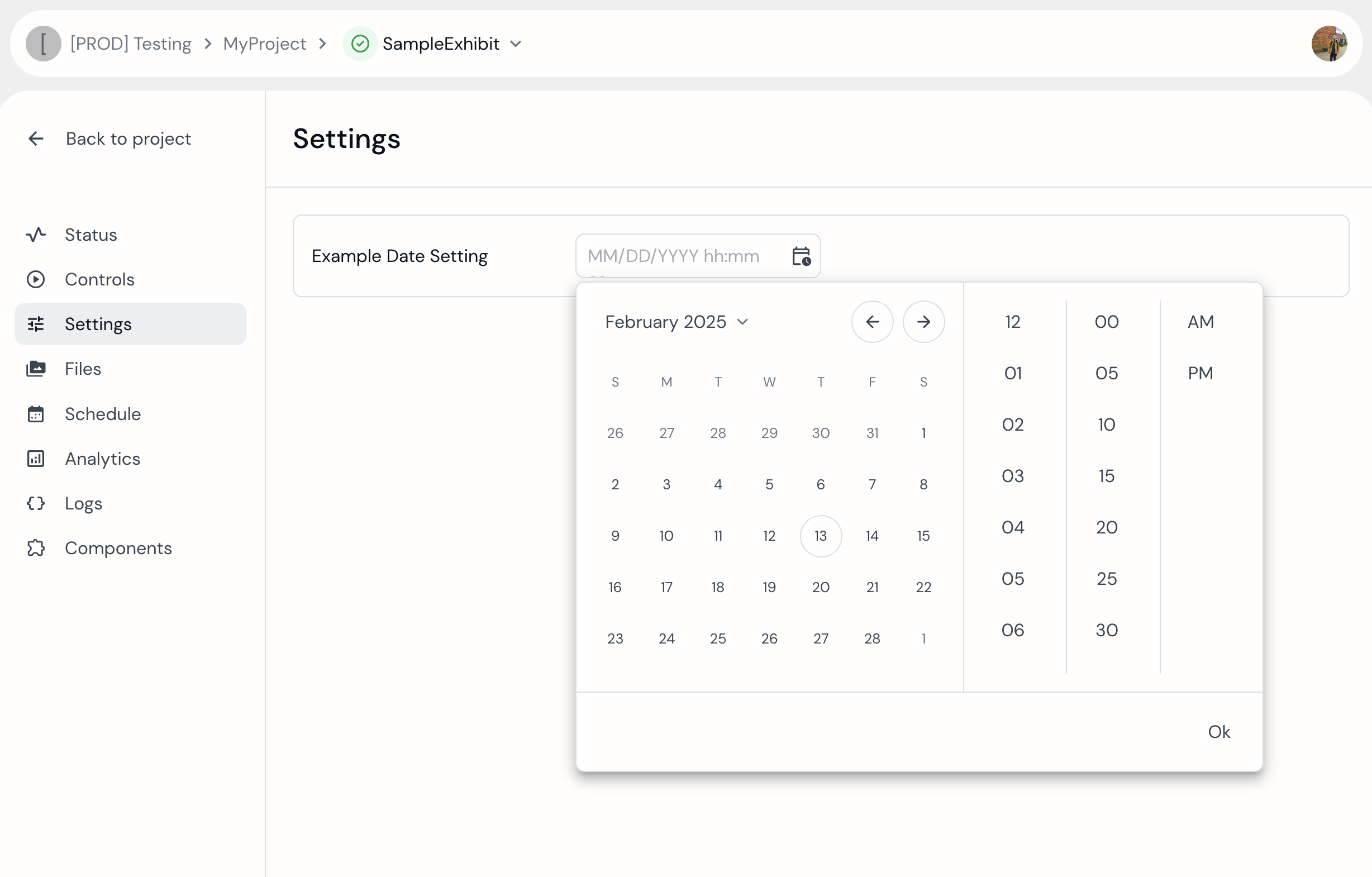 Sample exhibit showing "Date" type setting.
Values are sent to the exhibit in this format.

SettingsGroup
This setting type allows developers to group other setting types, similar to a file directory. It does not function as a standalone setting but instead serves as a parent for nested settings.
It is similar to the Group control type; however, instead of using an "items" property, this type expects a schema JSON property to define the contained settings.
export const MANIFEST = {
  manifest: {
      statuses: [],
      controls: [],
      settings: [
          {
              type: "SettingsGroup",
              id: "settings_group_example",
              display: "Example Settings Group",
              schema: [
                  {
                      type: "TextInput",
                      id: "text_input_within_group",
                      display: "TextInput Setting Within a Group",
                      order: 0
                  },
                  {
                      type: "Toggle",
                      id: "toggle_within_group",
                      display: "Toggle Setting Within a Group",
                      order: 1
                  }
              ]
          }
      ]
  }
}
SettingsGroups will appear in the Settings UI as these large buttons which hide the settings contained in them. When a user clicks on the Group button, the nested settings will open like a directory.
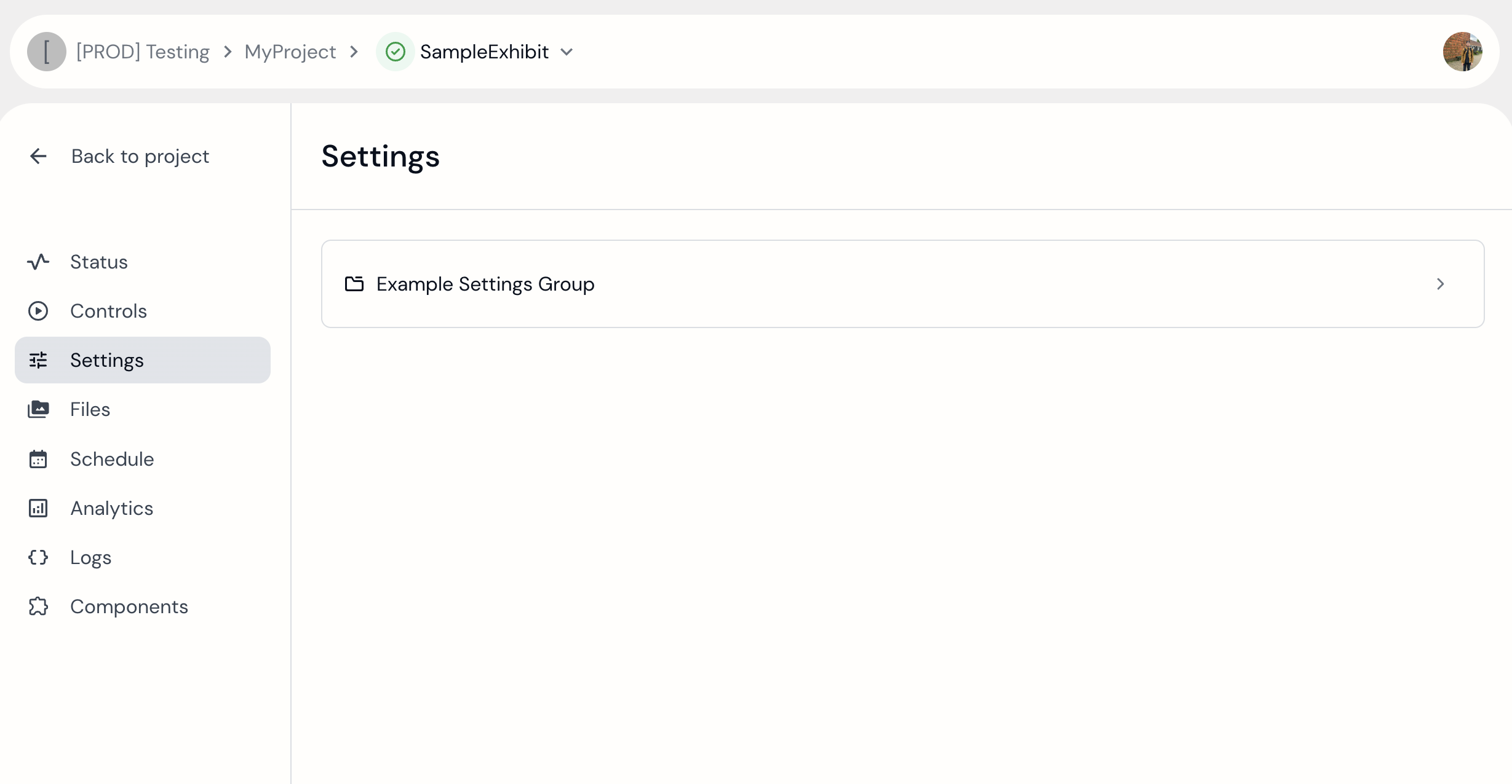 Sample exhibit showing a "SettingsGroup".
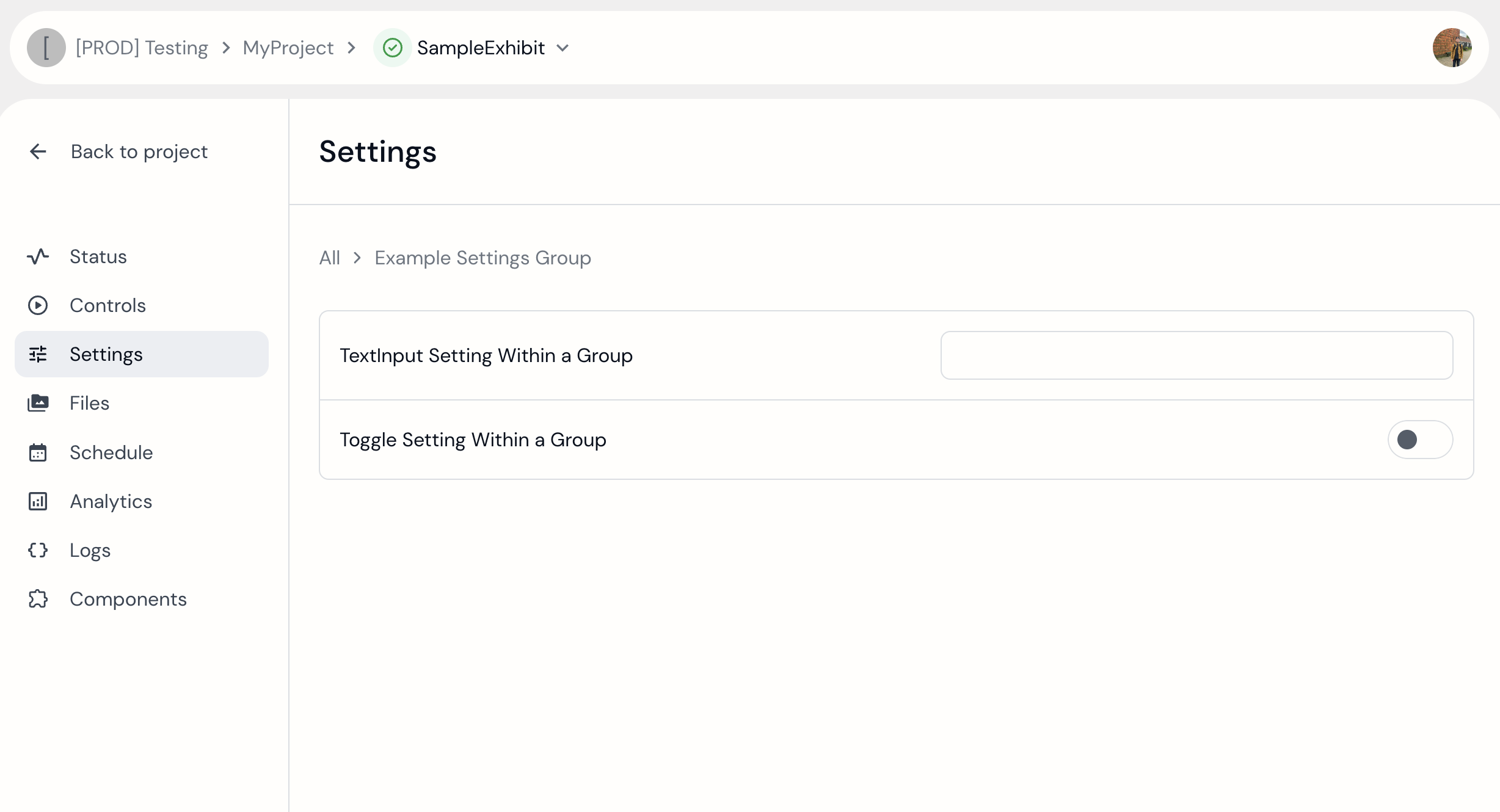 Sample exhibit showing "SettingsGroup" expanded.
Finally, when a setting nested in a SettingsGroup is updated, the websocket event’s id will have the following format: <SettingsGroupID>/<NestedSettingID>. Here is an example:

SettingsList
Finally the SettingsList type also defines a schema JSON property like the the SettingsGroups. However, this schema is interpreted by Gumband as a set of settings that users can dynamically add and remove. Such that there can be any number of instances of these schema of settings.
export const MANIFEST = {
  manifest: {
      statuses: [],
      controls: [],
      settings: [
          {
              type: "SettingsList",
              id: "settings_list_example",
              display: "Example Settings List",
              schema: [
                  {
                      type: "TextInput",
                      id: "text_input_within_list",
                      display: "TextInput Setting Within a List",
                      order: 0
                  },
                  {
                      type: "Toggle",
                      id: "toggle_within_list",
                      display: "Toggle Setting Within a List",
                      order: 1
                  }
              ]
          }
      ]
  }
}
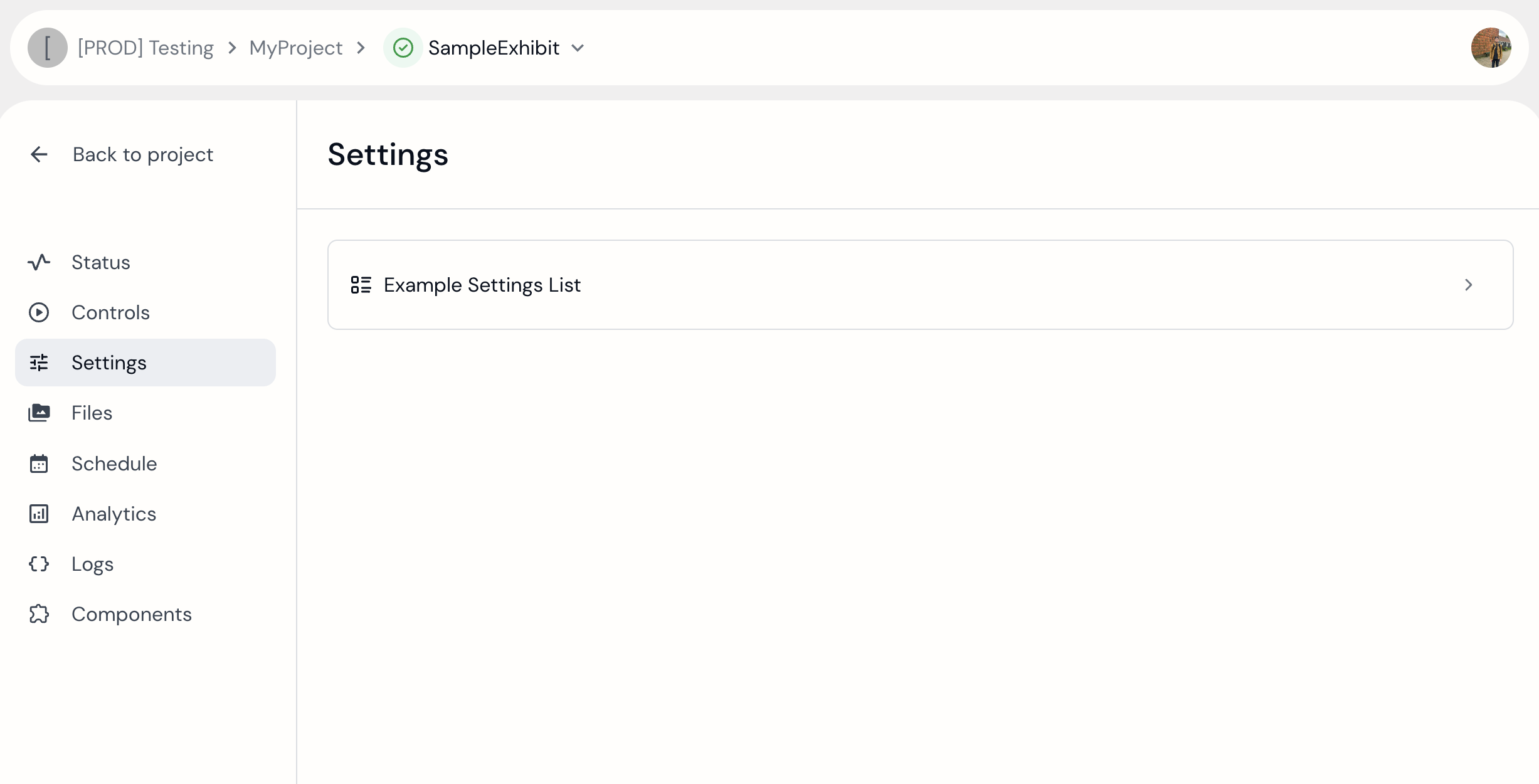 Sample exhibit showing "SettingsList".
For a closer look at the
SettingsList, see SettingsLists in depth